Splash Page Case Study
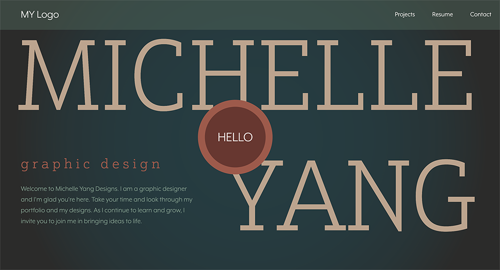
The splash page case study covers the process and inspiration for my splash page and hero. The main goal is to create a splash page that is unique and intuitive and reveals some of my personality and skillsets.

Concept Brief
I wanted my website to be easy to navigate while also being memorable. I chose a color palette that felt cohesive with my general mood of design and tried to keep type choices and layout in line with my portfolio.
Topical Research
These three websites (Matteo-Greco, Poolsuite, Aries Moross), show a lot of diversity in how a splash page can influence the look and feel of a website. They demonstrate how color choice, typography, layout, and optional motion can really impact the user experience.
Design Process
My design process started with cementing my color scheme and desired look and feel. I wanted to keep a muted, calm tone throughout my website while using some color which is how I landed on a general forest green, turquoise, and burnt orange color palette. I experimented with type choices until I found the two typefaces I thought suited the site (Justus Pro and Mr Eaves). Once the backbone elements were decided, I sketched out a few layouts until I landed on the current layout. From there, I solidified the HTML and CSS to match my sketch.
Conclusion
In conclusion, this project acted as a great refresher on HTML and CSS. The vast creative freedom allowed me to problem solve any issues that arose in the process. I feel proud and content with the final result of the splash page and am looking forward to how I can continue to improve upon it.


